I've always been into album artwork, even more so after i started collecting vinyl records a few years back. The record covers and sleeves from the 1960's and 1970's boasted some slick, bold design work, an aesthetic that is still used today and carries a romanticized nostalgia, due in large part to the social context of the time as well as the music.
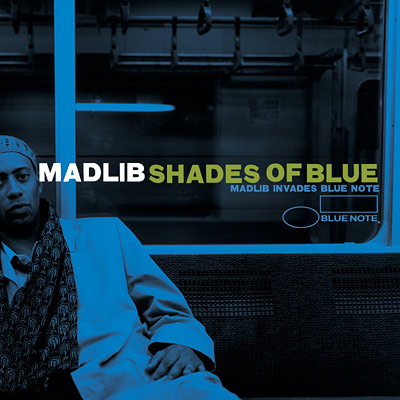
This album cover was designed by Jeff Jank, the art director for the Stonesthrow Records based in L.A. I consider it to be a contemporary designers take on a 'retro' style, an approach which also parallels the content of the record (a modern reworking of old music). This cover in particular references the artwork on Blue Notes Records. The monochromatic colour scheme mirrors the mood of jazz album artwork in the 60's, and the use of design elements already in the photograph (window framing) is also typical of work from this period (even the style of clothing is evocative of the 60's Chicago and New York jazz scenes!). A similar thing is happening in the Dolphy record cover below.

Thank you. This is a rich and under-researched area. I have a similar collection but not an encyclopedic one. There are interesting stories that remain to be told about designers like Bob Cato who crossed genres (rock-jazz-classical) in their album covers.
ReplyDelete