Friday, July 30, 2010

and photos..

A publication of May's 'New Frankfurt'
Bruchfeldstrasse
Seidlung Bruchfeldstrasse
Pruitt-Igoe
Pruitt-Igoe Plans for interior glass gallery
Pruitt-Igoe image publication in Architectural Forum
Pruitt-Igoe
Safdie's Habitat
An interior plan for Habitat

Many commonalities exist between architectural designs with intended functions to serve subsistent demographics in growing cities on an international scale. Aesthetics, targeted demographics, and idealized function link together the designs and realizations of Ernst May’s Seidlung Bruchfeldestrasse in Frankfurt, Germany, the firm of Leinweber, Yamasaki, & Hellmuth’s Pruitt-Igoe high-rise design in St. Louis, and Moshe Safdie’s Habitat exhibition in Montreal. These three designs are in response to the industrial revolution and shift from country to city living in the first 20 years of the 20th century, the middle-class move to the suburbs in the St. Louis in the 40’s and a more post-modernist architectural attempt to respond to individuality, communal living in a postmodern manner, respectively. Similarities between these three designs can magnify tensions of empathy and humanism in architecture and all of the processes of design which push it from an abstract and experimental ideal into realized functional structures. In these examples we are able to explore different methods of design, production, intended use, and user interaction.


The post-war corollary brought much duress and devastation to German economy , political stability, and societal infrastructure. With the flood of families and migrant workers uprooting their country livelihood, rural inhabitants moved to the centres of capital. The industrial city centres were drawing people in from the country side. The housing crisis during the years of the Weimar Republic was a huge concern. Unprepared for the boom in bodies and demand for affordable housing, workers earning subsitent wages were often forced into poverty, placed into older unkempt homes; a system which is commonly referred to as the trickle-down theory (Mumford, Frampton 42).


In 1925, architect Ernst May was appointed city planner to Frankfurt in order to deal with the pressing issue of social housing for the masses. From 1925 – 1930, 15,000 houses were built under May's 'New Frankfurt' plan (Panerai et al. 90). The New Frankfurt experimented with de-centralization of neighbourhoods which would surround the urban city centres. Opposing many theories and practices at the time whilst embracing the pre-fabrication and manufacturing as a cheaper method of construction, May constructed neghbourhoods with a classic modern aesthetic, interactive and supportive infrastructure, and utilized researched methods of sustainable architecture and living. He opposed theories of urban planning destined towards high rises employed by artists and architects like Le Corbusier and fought for smaller houses and complexes. One of his most successful de-centralized urban complexes was the Siedlung Bruchfeldstrasse in 1926-1927.

The success of Bruchfeldstrasse was due to a myriad of methods employed by Ernst and his assembled team of architects, artistic directors, engineers and many more. The two other architects involved in the designing of the Seidlung Bruchffeldstrasse were Herbert Boehm and Carl Hermann Rudloff. May was against architects being the sole planners and facilitators lest they “foist [their] personal living and dwelling requirements upon the masses... of families with a living income only' (qtd. in Mumford, Frampton 42). Bruchfeldstrasse, also known as the 'Zickzackhausen' or the Zigzag development, consists of a block of 650 dwellings divided into smaller buildings located on a 45 degree angle on the street (Dippold-Theile). This shift from parallel co-ordinates allows for more light and a even distribution of light throughout all of the buildings. Natural systems either reflecting or complimenting nature were central to the organization of structures on the grid (see fig. 1). Importance was placed on green space and incorporated into all aspects of the design. He incorporated community gardens in the courtyards to provide the tenants with some aspects of sustainable living which was a lifestyle integral to Germany's rural countryside for decades prior to the industrial revolution. He attuned to this demand in order to help the overall feeling of alienation of the mechanized world. He also included a large building equipped for a community centre with space for day-care and nursery facilities. This aspect of planning holds a stance of empathy and humanism in it's decisions of planning for its intended users.

Ernst and his team employed Taylorism and used this method in production and the layout of space in the individual homes to create a more efficient liveable space.

New frankfurt was ' unification of maximum fulfilment of function with minimum form'

normative building, gardens, playgrounds, etc. Documentation of the architectural avant-garde in social development. Aesthetically simple, devoid of historic ornament, aside from simple colour patterns, Bruchfeldstrasse is modern. With theories of rationality and function, May ethically approached all designs and plans in order to produce the best possible living situation for the lowest income bracket in Frankfurt. The New Franfkurt housing developments experimented with prefabrication in a number of ways including the sandard kitchen in all complexes which was designed by Margarete Schütte-Lihotzky. Although stemming from form of architectural expressionism it employed classical modern styles including flat roofs and metal industrial railings and balconies. By attuning himself to the needs and demands of the expanding city of Frankfurt and the demographic, while advocating for at least minimal structures for all, even the living-wage earners, he empathetically and humanistically responded to these demands in a sustainable way.


In 1949 the United States Housing Act put money towards the development of public housing and the design of developments to be erected in the downtown core of St. Louis. The architectural firm of Lienweber, Yamasaki & Hellmuth was commissioned to design one of the funded developments and the Pruitt-Igoe development was created. The postwar era brought upon the relocation of large amounts of white middle-class population into the surrounding suburbs. As this transition took place slums populations were growing rapidly in the business centre of downtown St. Louis. The decision to relocate the population inhabiting the slums so as not to threaten the business district was made and Pruitt-Igoe was a development to remedy this threat. (Bristol 352-353)


Pruitt-Igoe was a development of 33, 11 storey, brick high-rise buildings whose construction was completed in 1954. They were modern style brick buldings with gridded windows. They employed ski-stop elevator technology which allowed the elevators to stop on every third floor. In the centre of every third floor there were glass galleries which were intended to inspire and create communities among the apartment dwellings. It was this aspect of its design which initially were praised in Architectural Forum and Architecural Record when the designs were first published and regarded as 'innovative compensations for the shortcomings of the high-rise housing form' (Bristol 355). Initially, Leinweber, Yamasak & Hellmuth's design incorporated a mixture of single, small story and high-rise buildings but were eventually pushed by the Public Housing Administration to rid the plan of any possible unnecessary expenditures and provide as many units as possible on their 57-acre site. (Bristol)


This failure to represent the primary individual needs of the people it was intended for, unsympathetic rationalization of form and expenditure in drastic ways ultimately contributed to the demolition of all 33 buildings in 1972. Shortly after tenants were moved in problems arouse with vandalism, violence, and deteriorating quality of building materials. In 1951 Architectural Forum denounced mostly all of the qualities they highlighted earlier on including critiques on the elevators, deterioration of material and stated that 'steam pipes remain[ed] exposed both in the galleries and the apartments, frequently inflicting severe burns' (qtd. In Bristol 357). Ultimately it was a mixture of architectural design, social planning, the failure to upkeep the quality of grounds by the city, and experiments in prefabrication and material quality, and lack integrated facilities that contributed to it's failure and provided ample avenues to be targeted and criticized as the ultimate failure of modern architectural design. (Bristol)

The Montreal Exposition in 1967 was an international exposition where architect Moshe Safdie built his site-specific Habitat development designed as a low-income housing development. Initially designed much larger it had to be down-sized to a 158 dwelling development. Experimentations in prefabrication and manufacturing were incorporated into this design in hopes to realize a cheaper yet modern and futuristic model homes which could be accessible to the lower-middle classes. In his book, Beyond Habitat, Safdie explained his reasons as a young architect to participate in Montreal's World's Fair; “I went to Expo 67 partly because I was very interested in working on a real plan on a large scale, but mostly because of the possibility of a housing exhibit. I felt I would have the opportunity to realize it in some way.”

Although under much different circumstances then May and Yamasaki and Hellmuth , Safdie's intentions to build a structure for public housing were similar in ideals. Learning from the successes and failures of the 20th century architecture, Safdie combined a myriad of stylistic approaches to create individual module homes in hopes to secure a sense of individuality and separate space within a large ornamented block of concrete. He designed a modular housing system which comprised of individual concrete houses literally stacked on top of one another. Trading in the International Style aesthetic in respect to high-rises and 90 degree angular placement on a gridded block, he shifted each dwelling and created a fragmented pile of structures reminiscent abstract scene of houses in the hills of Italy.

Even though he intended it to be a space accessible to transit and the business district of the city centre, which it was in the months the Exposition was running, it was criticized later for it's displaced centrality after the Expo closed. Spectacular as spectacle the concrete stacks of complex structure proved a successful and cheaper substitution for individual homes and high rise buildings because it took on qualities of individual characteristics yet it's material was created in an easily per-fabricated manner. For the construction process, Safdie required a plant be set up next to the site in order to cater to the needs of the site and cut down transportation costs of having supplies and per-fabricated systems brought in independently.

Because of it's reputation as spectacle it was received well and there was a high demand in tenant applications which ultimately raised costs and became inhabited by tenants from the upper-middle class demographic. All of these designs experimented and took certain risks in manufacturing methods and the implementation of idealized spaces for interaction within the social housing domain. The successes were met the ability to attune oneself to the needs of the demographics they were realizing habitats for.


Work's Cited

Mullin, John Robert. City Planning in Frankfurt, Germany, 1925-1932: A Study in Practical Utopianism. Web. July 27 2010.


Mumford, Eric, The CIAM discourse on Urbanism, 1928-1960 Massachusetts: M.I.T, 2000. Online. July 26, 2010.


Bristol, Katharine G., “The Pruitt-Igoe myth” American Architectural History: A Contemporary Reader. ed. Eggener, Kieth L. New York: Routledge, 2004. 352-379. Print.


Safdie, Moshe. Beyond Habitat. Montreal: Tundra Books, 1973. Print.


Von Hoffman, Alexander. “Why They Built Pruitt-Igoe” From Tenements to the Taylor Homes: In Search of an Urban Housing Policy in Twentieth Century America. ed. Bauman, John F., Biles, Roger, Szylvain, Kristin M. Pennsylvania: The Pennsylvania University State Press, 2000. 180-205. Print.


Holgate, Alan. Aesthetics of Built Form. Oxford: Oxford University Press, 1992. Print.


Panerai, Phillipe, et al. Urban Forms: The Death and Life of the Urban Block. Oxford: Architectural Press, 2004. Print.


Frampton, Kenneth. Modern Architecture: A Critical History. London: Thames and Hudson, 1992. Print.


Thomas, Bruce. “Culture, Merchandise, or Just Enlightenment? New Architecture at the Millennium” Journal of Architectural Education. 1997. Online. July 26.2010.


Bloomfield, Julia, et al. Empathy, Form, and Space: Problems in German Aesthetics, 1873-1893 Santa Monica: The Getty Center for the History of Art and the Humanities, 1994. Print.

Caitlin's project.

Oh my gosh, what a whirlwind of crashing computers today. Fine end to a whirlwind course. Didn't think this blog post was going to happen, but here it is.

Enjoy the summer, congrats on graduating Christin and Drew.

Liberation, LSD, and Style Liberte

Insert witty comment about finishing here. I'm really just very tired.

link to paper

have a good summer, and SAYONARA NSCAD. (I hope)

Steve's Research Project.

Here I come....VRROOOOOM! Across the finish line!
Tally Ho!!!

Here's my article.

http://www.mediafire.com/?d9sotuqcwu0ft9c

All the best to everyone.
See you around.
Peace.

Khuyen's Research Project

Updated essay:

http://sc.ambidextrous-designs.net/kforsythe_essay-final.pdf

Jacqueline's Research Project

And, here's mine!

http://www.mediafire.com/?up5myxqvphkn28a

Have a wonderful August everyone!
J

Drew's Research Project

http://www.mediafire.com/?14j4qt25zygw8ak

Enjoy whats left of the summer guys and girls! Thanks for everything :)

Thursday, July 29, 2010

gabe's research!

Following what Khuyen and Nate did because it seems to make a lot more sense then posting so much text, here's a link to download my essay:

http://www.mediafire.com/file/1oktkmi2c2yin81/gabwhite_researchessay.pdf

Great.

Well I doubt many are still regularly checking this...

Nice looking examples of what they call "retro futurism in poster design"

I particularly like the one that says "2009 is the new retro". Quite funny in light of this class... Not sure if there's a heck of a lot besides shape that makes these examples of either, but nonetheless.

Wednesday, July 28, 2010

great presentations yesterday fellow scholars
Laura really enjoyed all of your presentations thanks to the high percentage of pop-culture references.

Drew you have a really tight theme and network of information of relative comparisons and contrasts. Demographics will be a very interesting thing to explore when looking at the intergenerational response to one type of shoe. I am also interested in the way Nike shifted the image of Converse.

Gabe You have a lot of. I think, exciting content to work with. Whether Martha S. is good or bad does not need to be the argument but the response of she prokovoked and the demand she catered to is fascinating. I think it will be interesting to compare Larkin, Stewart and Etsy since they all have a very different demographic but lifestyles they hope to inspire.
Gabe I have been thinking a lot about yours especially in the context of institutionalized and objectified (in a sense) cultural capital initially theorized by Pierre Bourdieu. The institution of domesticity and patriarchy as an institution punishing 'female flippery' and punishing it (by deeming it flippery) to inspire 'productivity'.

Monday, July 26, 2010

my essay

http://www.zshare.net/download/78716806e5206b2a/

^this is a download link to my research essay, because this blog does weird
things when I try to insert photos

today's presentations...

So I guess I'm going to be reflecting on the proposals of Anne, Khuyen (who already posted her whole paper on here, good for you!), Nate and Jacqueline - I wish I felt more confident responding in class but I feel more articulate when posting here. Anways...

Anne
I had a quick chat with you after class about what your thesis could be. Don't be so worried about having a complex thesis - you have a lot of interesting and thought-provoking information, just think about what your gut feelings are after all of this research, and go with that for your thesis. As far as specifics, perhaps you should concentrate your paper on why the zigzag building design of Ernst May's ended up being more successful than the work of either Pruit or Safdie. Exactly what insight/background/team did he have to help him create housing that "worked"? From what I gleaned of your presentation it seems that May had a more humanistic approach to the problem of affordable/enjoyable housing than the other two, though they were also working towards the greater good. You could deconstruct the design principles prevalent in each time period your buildings are from, and from this draw your own conclusions on which ideals ended up working out.


Khuyen
I know you've posted your paper online already, but I'll bite anyway. Your topic is a consice opportunity to educate those not aware of design's power in how simple things like the composition of two images in a single layout can direct the reader to see a particular message or flow that may not be hinted at obviously. I have just one query - I would like to see a little insight into how much autonomy a reader has when interacting with a meticulously planned book like Mau's Life Style. Does such a narrated format really allow for the reader to "form his own decisions", as you said in class? Clearly, yes, we all have some degree of independence when reading from a text, but how pervasive do you think good flow/design is? When something is well-designed, can we ever claim that the reader is truly left to come to his own conclusions? Is something that is designed also intrinsically narrative?

Nate
First of all - I love the cover art for Attica Blues. That photograph is beautifully shot, staged or not. Then again, when it comes to graphic design, how can you argue against the conscious composition of a source photograph? The Tongue in Chic album cover is an interesting work, and I'm glad you picked this to relate with the first piece. It is interesting that we all reacted the same way to the work - awkward, unsuccesful, ambiguous. What I find most awkward about the cover is the garish background color. My question is this - if you can find out how much influence each artist had on their album cover (for example, the partially self-designed album art for MIA), what would be your judgement on the corrolation between artist involvement and album "success"? Personally I think the MIA cover is one of the most hideous album designs conceived, but as you said it was very succesful and reflective of the artist and her influences - it was a sucess.

Jacqueline
Wow. Super interesting topic, and I must say I don't envy you for the breadth and depth of research you must be doing to find information on such an abstract topic. But it's interesting to think of the phone as reflective of not only society's changing needs, but of the mutating (and yet partially stagnant) role the female image plays in advertising. Particularly interesting is the attempt in 1960's to bring style and sensibility to the phone by offering it in many bright colors. However my question concerns something else - how do you think the role of the woman is changed in 2004, where gender roles in advertising, while ever present, have been drastically toned down to an almost subconscious level? I just spent 15 minutes looking for an ad for the LG Chocolate (i believe) from 4 years ago or so that REALLY set me off, in a bad way. It was an image of the phone - photographed very sleekly or entirely generated in illustrator/a 3d program - surrounded by a background of typed phrases such as "touch me. caress me. hold me. stroke me. love me. whisper into my ear." The color scheme of the advertisement was a dark chocolate brown mixed with reddish hues. I wish I could find this ad for you, because as ambiguous as it looks on the surface, it is obviously engendering the phone as a sexual object of desire. Perhaps not aligned perfectly with what you are writing about, but worth seeing. I'll keep my eye out and bring it to class if I find it :)

Sunday, July 25, 2010

Three Design Manifestos

My final project, is here. Because I hated the blog format and preferred to do it in InDesign.

Friday, July 23, 2010

Reading withdrawal...

Since class is almost over and our 6 hour-a-night reading schedule is no longer I thought I should post an interesting essay on matter and the linguistic turn.

I say if you are looking for some interesting, enlightening, and stimulating reading, read this essay.

It's called Posthumanist Performativity: Toward an understanding of how matter comes to matter by Karen Barad.
http://www.kiraoreilly.com/blog/wp-content/uploads/2009/06/signsbarad.pdf

Instead of Essay, I give you...

Designer Chair Wallpapers!

(Sorry I couldn't help myself)

Wednesday, July 21, 2010

Critical Visualization

Peter Hall's "Critical Visualization" outlines 3 approaches to information graphics. The first is tehnological, which looks at effectiveness, the second is scientific, which looks at reducing complexity, and aesthetic, which looks at style. This perspective of breaking up information graphics into three different approaches and also cautioning towards the subjective narrative that data inevitably conveys is in line with our current discussions on postmodernism. The fact that charts and graphs still boils down to being able to convey a narrative and that it is ultimately biased worries me a little -- is there any way we can regain an idealistic view of what we consider true, or are we forever going to be questioning and doubting everything that is human-related?

Nature & Natural Curiosity

As students of the visual arts, we have all no doubt been asked, at one point in time or another - "What is good design?" It's an impossible question to truly answer without being fairly general, but I'll attempt to lay out some basic principles that we all seem to agree on in class. Design is looking critically at the efficiency and function of something; it is the ability to approach a problem laterally, from many angles and with full knowledge of the purpose & placement of the object or art in question to be designed.

Is there anything in the world that we can claim to be perfectly designed? I truly believe so. The world itself - barring poorly executed deep water oil drills and wars faught over petty issues born from our immaturely-developed Ego - is a triumph of design, whether you are a person of faith or not. Over the course of billions and billions of years, the earth has been going through the process of natural selection - from the first proteins that became attracted to each other, to the development of the perfectly deceptive and deadly pitcher plant of today. Natural selection is the ultimate critical process - any genetic feature of an animal or plant that is NOT the most advantageous will eventually be weeded out of the gene pool, simply by virtue of having a slightly lower reproductive rate. It's a very slow process, but it is responsible for some of the weirdest and most specialized designs adapted to survive in inhospitable conditions. Pictured left is the famous star-nosed mole, a small and totally blind rodent that has evolved a spectacularly grotesque nose packed with over 25,000 sensory receptors in order to feel with
great detail the subterranean world around it.

"Nature's concern is for the most economical management of the overal system ... this approach to design seeks to adapt specific advantages observed in natural organisms into human technology"


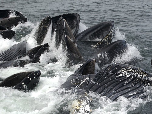
Other examples of great natural design are the balleen whales, who despite their enormous size have been designed not only to survive as entirely aquatic mammals, but have developed an in-mouth straining system and a pleated, expandable belly in order to suck in great volumes of plankton-rich water which is then strained through their balleen. Every feature of every animal we encounter is a finely-tuned design, a design that has been tried and tested over an unimagineable amount of time.


With an understanding of the reach and complexity of natural adaptations to cruel natural problems, it's not a stretch then to understand the importance of looking to nature as a resource for solving some of our manmade problems. There are already numerous examples, some of which have been mentioned in Aldersey-Williams' essay. Other notable examples of this design-from-nature principle are things like the development of kevlar fibres mirroring closely the structure of spider silk, and, relevant to our course, the study of the way in which termite mound design and composition reduces the temperature of the colony in order to apply this knowledge to contemporary building design.

Aldersey-Williams draws a connection between Charles Eames and Richard Feynman; two men who could both be considered "designers" in the context that I stated at the top of this post. They were separated by discipline and, because of this, did not have the opportunity to discuss the parallels present in their work regarding the concept of harmonious design, and to bring understanding to complex and seemingly mysterious processes. I will, as the author of Applied Curiosity has, the necessary issue of consilience -

"the reunification of the strands of intellectual inquiry artificially separated as a consequence of the growth of specialized disciplines in science and the humanities"

We've touched on this issue before, and I think it is a pressingly important problem that needs solving. Engineers and scientists know how to make a complex and functional machine; designers know how to make that machine easy to integrate into the lives and behavior of the people it is destined to serve. Scientists amass vast amounts of data about the deteriorating environment, but designers are the ones truly responsible for communicating this information to the ignorant masses in a format that is easy to digest.

One final question to you... is biomimicry - the study of natural design in order to emulate a man-made version for our benefit - post-modern? If so, the irony is palpable.


bubble-netting, a predatory strategy adapted by several whale species, involving the creation of an amazing spiral-shaped wall of bubbles in order to trap and coral fish.

Design Stars

Yves Behar is not italian, nor is he Italian educated and this notion of things being part of a disappearing italian brand seems very strange and a little bit ridiculous! As the article describes it, an italian designer is just someone who takes time and care in the design process and works closely with industry. Behar is unquestionably a good designer, but he isn't unique. There are plenty of good designer that have the "italian" qualities describes in the article. Naoto Fukasawa, Marc Newson, and the design firm IDEO all espouse these qualities. I think that this article is so obviously biased towards Behar that I find it difficult to take seriously. The idealization of certain 'star' designers and architects, and schools is a problem that we have discussed a bit in class and I think that this article is one of many that are responsible for this kind of issue.

This is a high chair designed by Behar I thought it would be a nice way to end the class considering it was high chairs we discussed on the first day. Thoughts?

Give a Damn

In this interview, architect/designer Cameron Sinclair talks about the humanitarian designers obligation to fully consider social contexts when solving design problems. He stresses the need for true sustainability and designer for future needs and not solely the present.

He brings up a strategy known as "leapfrogging", where in a post disaster situation, outdated technology (like telephone lines) is substituted with newer technology (like wireless) in countries with a less developed infrastructure. Sinclair also mentions using low tech solutions in more developed countries in the case of a blackout or other technological fallout. I thought this was a good example of a postmodern approach to design, drawing across time periods (and cultures) for potential design solutions.

Several of the design solutions discussed in the interview have actually gone into production and been used allover the world. So is this postmodernism thing really so unfocused that it can't have real world impact? Or are AFH and other humanitarian design groups still searching for unrealistic results.

And That's a Good Thing...

Say what you will about Martha, but the fact is she's a pretty admirable lady. Simultaneously embodying business mogul and fantasy homemaker she bridges the "traditional gender boundaries... [and] exemplifies the (masculine) utilitarian individualism at the heart of the 'do-it-yourself' movement." Wajda describes her as a "dominatrix of domesticity" which makes me laugh. I remember years ago a friend suggesting a great idea for reality TV - Martha moves into a frat house. Who do you think would move out first? Would Martha lose her mind trying to deal with keg parties and dirty bathrooms or would she whip those boys into shape and have them serving miniature puff pastries filled with brie and asparagus at the next kegger?

A sophisticated business woman, Martha has put her finger on the social anxiety surrounding the home. By promoting a "lifestyle in which the individual is not only laborer but also CEO of his or her own household," Martha sells us a nostalgic sense of comfort and family. And we're buying it. $500 million dollars worth at a time.

To me the irony of Martha Stewart is that while she promotes the "do-it-yourself," self-sufficient ideal (going so far as designing her company's Stock Certificate in house) it is through "purchases of those ideals" that the American consumer buys in. (pun intended)

Ethically, should Martha Stewart be capitalizing on our social insecurities and frantic need for comfort and perceived self-sufficiency in the home? I, personally, don't think she is doing anything more or less insidious than any business person out there. Maybe it feels insidious because unlike Bill Gates or Conrad Black, there is a sort of motherly attraction to her, like just maybe, in a different world, she could have been your mom (in an omnipresent, Big Brother kind of way.) You could even say she's up front about it, the company is called the "Martha Stewart Living Omnimedia" after all.

Martha herself may provide a fantasy ideal and a comforting sense of bygone times when there was someone keeping the home, but she has an army of people working behind her. As Wajda points out, "Martha Stewart the person must become Martha Stewart the 'brand.'" This branding of her person/identity is what is so effective at bridging that gap between public and private, Martha "invites us into zones of intimacy" which at once make us feel comfortable with her and also feel more desire for comfort in our home.

Intentionally or not, Martha, as a modern day Miss. Manners, has brought into question the division of public and private, of business and home, of DIY and consumer, of male and female, domains. If you ask me, that's a good thing.

Contemporty Design and Archetecture.

In Hal Foster’s article “The ABCs of Contemporary design”, he presents us with a mock glossary of terms. The definitions of the 26 terms (one for each letter of the alphabet) is instead a critical reflection on designs relationship with corporate philosophies.
Foster seems to suggest that it is the corporation that dictates style and creates fetishized objects (architecture in America in particular), using the designer as a tool to accomplish this, and in the process eliminating (or at least discouraging) critical thought. What he seems to otherwise describe is that there is a lack of engagement with the audience and that they are but a collection of statistics and trends.

I don’t really agree with what he is arguing. While I do concede that there is a tend to recycle the past even today, or being stuck to strict guidelines for designers to follow, I don’t think it’s as locked-in as Foster makes it out to be. I think designers are, in fact, afforded the “running-room” that they need to explore and create, but how much is more dependent on which company is backing you.

Author as Designer

In Michael Rock's "The Designer as Author" article, the validity of recognizing designers as owners is explored. He compares the identification and classification of design from Modernist (or Structuralist) thought to post-Modernist (or post-Structuralist) tendencies of fragmentation. He draws heavily on Foucault and Barthes in their dealings with the "death of the author", but at the same time attempts to see if there is validity in the celebrated designer through several methods of identification. The first is from Truffant and Sarris's film theories: a director (author) is recognized through their technical proficiency, style, and internal meaning. However, designers may exhibit proficiency and style, but internal meaning is often omitted or conforms to the needs of the client. The second method is poetic; most recognized work takes the form of an artist's book or an activist design. However, books are self-referential and alienating, and activist design speak of a community, and have overt intentions in their use of style. The best examples of designer of author then, could be books about design (eg: Ellen Lupton, Rudy VanderLans, Bruce Mau).

Of the Modernist approach, design as authorship is described thus: "The rejection of the role of the facilitator and call to 'transcend' traditional production imply that authored design holds some higher, purer purpose. The amplification of the personal voice legitimizes design as equal to more traditionally privileged forms of authorship."

Of the Post-Modernist approach: "If we really want to go beyond the designer-as-hero model, we may have to imagine a time when we can ask, 'What difference does it make who designed it?' "

I think this exploration of whether designer is an author needs to be discussed further. Which is more important: the collective or the individual? What I think Rock is trying to resolve is the prioritization of one over the other, when both are equally important. I read an article in STEP magazine about star designers, and the fact remains is that we all like to have idols and some people will forever need to be idols, despite being in a field where our work is meant to serve the client and customer, not ourselves. The idea that authorship commands authority is something I'm glad Rock took the time to point out. With the Internet, we're largely decentralized in that everyone gets to express their opinion, but I think this has also led to the reinforcement of our need for authenticity in a different way. Users become authentic en masse: Amazon's customer reviews are useful because we get to see an overarching consensus versus one expert commenting on the book. This is a lot of individuals being taken as a collective: while it is more time-consuming, it is democracy. Authorship is validated from a multiplicity of authors, and design is already that: studio and project collaboration between many individuals.

Tuesday, July 20, 2010

For those researching gendered spaces and designs

Here are some books I have looked at available at NSCAD...

Sexuality & Space by Beatriz Colomina NX 650 S8 S48 1992

Discrimination by Design: a feminist critique of the man-made environment by Leslie Wesman.

Eames house: a gift for all your little gifts...


From reading Beatriz Colomina's essay on the philosophy behind the Eames house, you get a sense that Charles and 
Ray Eames were empathetic individuals who lived a very wondrous and optimistic life. The photographs they themselves set up and shot of their architectural work contain abundant images of children playing; the Eames saw in the childs mind a vast wealth of honest thought and straightforward intention, which they considered the basis for the best design ethic. This is evident in their career-spanning production of entertaining children's toys and in the many examples of design they had crafted with a specific acquaintance in mind. Charles Eames is quoted as follows -

"The lounge chair, for example, was really done as a present to a friend, Billy Wilder, and has since been reproduced."

The Eames had found a way to establish a career on
 the basis of creating good design for friends, friends who had specific design needs that were apparent to their contemporaries. From the same statement by Charles -

"...a multiple-exposure photograph of Billy Wilder moving back and forth on the plywood lounge chair of 1946, claiming that it was designed so that the "restless Wilder can easily jump around while watching television."

I want to use this quote to digress to another aspect that Colomina looks at w
hich speaks to me as a photo major. She mentions that the Eames were fond of using photography both as a process towards completing their design projects and as a means to document their work in a tight and narratively controlled manner. The photograph was also used by the Eames as a conceptualization tool; though pre-digital, they would cut and past negatives/prints to make photorealistic mockups of the ideas that they could not yet take to production.

The third and final important point that I take fr
om this reading is the Eame's philosophy behind the place architecture holds in our lives. They believed not only in architecture free from constraints of historical tradition and figurative ornament, but they rationalized this with the notion that the home is but a vessel for its inhabitants and their dearest possession. Here we see a train of thought quite separate from the traditional Modernist aesthetic of pure, reduced form, though in the end they have similar results. Eames architecture may seem cold and minimalist, however that is simply not the case - Charles and Ray believed that the heart and soul of a house, that which makes it truly a comfortable and safe home, is the way in which we fill our houses, and how well we allow the display of our personal objects within the space. Eames furniture and architecture is designed not to take any attention away from the objects placed in and on their surfaces.

As a final addendum, I would like to connect the Eames' joyful approach to their work with a favorite photographer of mine, Abelardo Morell. Morell takes a lot of inspiration from his two children, and often photographs from their wondrous perspective or documents the fanciful games and worlds they can create from thin air. A quote of his has stuck with me for many years now. 

"The stuff right under your eyes is the most wonderful universe - if you care to look with young eyes"


Monday, July 19, 2010

OG - Retro - Re-Retro - Re-Re-Retro...


My final paper will be based on sneakers (surprise, surprise). More specifically, I will take a look at sneakers that were originally produced decades ago but have continued to be retro'd (re-released) to the present day in a variety of ways.

Using my own collection as well as other printed and online material, I will cover their initial designs and colorways and examine how, if at all, they've been modified over the years to fit the demands of/appeal to sneakerheads today in terms of collaborations, hybrids, color schemes and so on.

In addition, I will take a look at how they were marketed as well as attempting to pinpoint the reasons why some sneakers which are older than most of the people who consume them still remain as popular today as when they were originally released.


Cooking through the ages


I am very interested in baking and cooking in the home and how it has progressed with the changing appearance and abilities if the cooking and baking products and accessories. I was really inspired by our discussion of Tupperware that we had in class today. The Tupperware parties were really important in changing the way we approach certain business now, and the actual Tupperware products changed how food was used and stored in the kitchen.

I want to use the red bakelite dish that we talked about in the first week of class, and how the introduction of plastic really changed the landscape of the kitchen. How the ability to save and store food changed what and how people cooked. Finally I would like to talk about the now iconic Kitchenaid mixer. Let me know what you guys think!

Both of Victor Papanek's articles ("Do-It-Yourself Murder" and "Neon Blackboard") focus on human/designer need as the main constraint in all design problems. The above diagram is a reflection of the current (articles written in the 1970's) mindstate of designers, design schools, and society as a whole. Papanek blames design schools for teaching design skills and philosophy (often antiquated), but neglecting to teach practical, present day application of these and other essential skills required to make designs for the "social good". In turn, he argues that designers graduate and begin to diseminate design solutions which only deal with the surface of any given problem.

Papanek directly attacks American commodity culture, blaming corporate policy and economic concerns (ie. sales,shareholders) for the lack of interest in the bottom half of the triangle. He stresses that design should serve a moral code, that acknowledges the human need for entertainment and leisure, but not by sacrificing physical and psychological needs.

However, Papanek returns to a Modernist mindstate when he calls for increased standardization, and a drastic pairing down of the consumers choice of "styles". On top of that he demands a very broad and loosely defined education for designers, but offers no concrete examples. Post-Modernism is hampered by the same problems that Modernism faced; unrealistic expectations motivated by an overly simplistic understanding and assesment of world problems.

So my question is a big one, if design schools are producing designers who are specialized in dealing with the concerns at the top of the pyramid (sales, style, etc.), and if corporations, companies and design firms will continue to hire such designers, is there really a need for a change in education/philosophy? GM pioneered the idea of styling cars to imply progress, and even with society's increased interest in "green" policies, isn't it possible that we could just continue to fake progress and change on the surface and keep the capitalist machine rolling without changing the engine?

Postmodernism

In keeping with our conversaton at the end of class, I thought I would start with a quotation from Venturi:

"Aesthetic simplicity, which is a satisfaction to the mind if valid and profound, derives from inner complexity. The Doric temple's simplicity to the eye is achieved through the famous subtelties and precision of its distorted geometry. ... The Doric temple could achieve apparent simplicity through real complexity."

Venturi also says that "Less is bore."

This quotation immediately reminded me of an "opposite" post-modern position. I thought it might be good to offer another view of the relationship ebtween simplicity and complexity which I think links more clearly to Venturi's later comments.

Studies in Complex Adaptive Systems (CAS) also have a saying: "Surface complexity stems from an underlying deep simplicity." For example, "chaotic" behaviour on the surface may actually be guided by underlying principles and a set of minimum requirements. If I ask individuals in a a group of 100 people to identify two other people and then postion themselves equidistant between the two people, there will a great deal of movement and confusion as everyone moves around. There would be no visible pattern to the activity and it would look totally disorderly; however, knowing the underlying "rule" (or the deep simplicity) makes "sense" of the chaos. The point is that these underlying principles allow CASs to adapt to an ever-changing environment versus a rigid system which does not permit self-organization and in which there is no diversity but all "agents" are the same.

Venturi speaks to this when he says: "Then equilibrium must be created out of opposites." He also advocates for differentiarion as a means toward survival which is congruent with CAS behaviour.


Perhaps the City Hall of Mississauga is an example of surface complexity with deep simplicity.


Another rejection of the orderly, efficient and standardized is Superstudio. These Italian radicals focused more on the consumer object and the domestic environment. They promosted "evasive design" which they defined as "the activity of planning and operating in the field of industrial production assuming poetry and the irrational as its method, and trying to institutionalize continuous evasion of everyday dreariness created by the equivocations of rationalism and functionality." This links to Venturi's "Less if bore" in its call for variety and freedom.

Retro Television

Hey guys!
I don't know how "rough" this outline is supposed to be, but I want to try and write my essay about a comparison between three different televisions sets. I'll write a bit about the history and do a compare and contrast them based on what we learned in class.

My biggest stumbling block is trying to find the names of the designers of the televisions (mostly google searches will just get me sites selling parts or the sets themselves.) So here's what Ive got:


RCA 621TS

The only set I managed to find the designer for. This, among other sets, were designed by Romanian born John Vassos for RCA in 1946.


EKCO TCG316


UK designed television set. Example of a number of sets I found that folded away into generic wooden furnature. Thought that was kind of interesting having the television built to be out of sight, out of mind, when not in use. dated 1957.


JVC 3240 "Videospere"


Lookit that thing, crazy innit? Plastic case housing inspired by an astronaut's space helmet. dated 1970.

Video Games: An evolution.

Over the weekend I attempted to come up with a topic for the research project, with little success. So, I thought I’d go back to the beginning and explore my original idea of retro: the evolution and revival of video games.

I’d like to talk about gaming in its beginning stages, and how it was marketed to the masses. Also, as those masses grew older, how companies dealt with the shift in generation, focusing on a new target audience.

vs

I’d like to talk about the consoles themselves, along with accessories, and how the designs have changed. Going from an NES to a Wii, or a bulky Xbox to an Xbox 360. Looking at shape and color as a reflection on consumer and societal wants.


Also, how companies have tried to integrate products into home entertainment systems through design. (ex: the sleek looking PS3 with a bluray player built in)


Finally I’d like to address the idea of retro in video games, and the revival of old characters and designs in advertising campaigns and merchandise.


I still need to do some more thinking on this, but hopefully that is enough to start with.

Sunday, July 18, 2010

Liberation, LSD, and Style Liberte

Hey guys. First I wanted to apologize for the late post tonight - I spent most of the weekend shooting for some whale-watching cruisetours in digby county..exciting stuff, but too detached from class for my liking.
Anyway. This course has rekindled my love of art nouveau, particularly in print form. Through that love, several years ago I became familiar with the work of Nigel Weymouth and Michael English, who together were known as "hapshash and the coloured coat". They're known for art nouveau-inspired psychedelic rock posters of the 60's, but until taking this course, and, particularly, reading Guffey's chapter on the 1960's reccurence of the art nouveau aesthetic, I became more interested in what the appropriation of the older style came to symbolize for the now infamous hippy generation. What connections can we draw between the idealizations of the art nouveau and art frisco movement, as this later "movement" is known? How can we see our society's acceptance of technology, well cemented by the 60's, reflected in the meaning imbedded in later iterations of similar "styles"? Where does psychology and sociology come to play in this work?


My three examples of work are as follows. First, a poster by Alphonse Mucha, considered the pinnacle of printed art nouveau matter. Mucha was somewhat of a hermit to the 'fad' of art nouveau; he believed his art to have a simpler, spiritual origin rather than being a perfect and beautiful mixture of technologically advanced technique and organically based ornament. I believe his belief of artistic origin is fascinating when translated to the movements later recurrence.


Chronologically next comes the poster designed by the members of Hapshash and the Coloured Coat. The influences of LSD-fueled drug culture and the psychedelic aesthetic are clear in this piece. Also apparent is the reference to Mucha's innovative illustrative style; the reclining nude, strong emphasis on outline, and organic/curvolinear forms all originate from art nouveau ideals. The text is ornate and in many cases takes concentration to read. New to this iteration of the style are the vivid and psychedelic colours, a trend visible in all 60's eras underground poster that reflected the visual nature of a culture that grew to embrace hallucinogenic drugs.

The third piece I want to use to relate these anachronistic posters to current events in todays culture. I've chosen the poster for the Evolve 2010 Festival. Unfortunately I've spent hours on the internet without being able to find even a tiny thumbnail of this years' poster (and I consider myself somewhat of an internet sleuth...), so for now I present to you the 2006 poster for the evolve music festival. The current poster uses a lot of similar themes and styles as this older one: bold colors, simple type, representative outlines of dancing people. I want to relate this poster with the more organic nature of my earlier examples, tying this in to our ever more technological culture, a culture increasingly more demanding of simplicity and ease of understanding.

Questions? Ideas? Comments? :)
I would like to explore urban planning and public housing designs and the pros and cons of all three designs and ideologies.
Le Corbusier's 'Pavilion L'esprit Nouveau' and a prototype for a method of thinking of the home.Prefabrication and Gunnison homes; the designs and realizations of accessible, affordable, and individual homes. (1947)
Federally funded Pruitt-Igoe housing development in St. Louis designed by George Hellmuth and Minoru Yamasaki. (1951
And more recent designs like the 132 Housing Block in Madrid. by Estudio Entresiti.
I am interested in the modernisms utopian housing ideas of the early to mid 20th century and the theories behind the design as well as the construction of each design as a realization of spaces designed to literally house social transformation. I also am interested in the designs and realizations of these designs and the different forces beihnd them spanning from the individual architect/artist, projects funded and desired by the government, the capitalist stance regarding Gunnison and prefabricated homes and the new design in a contemporary era of the Madrid housing block.

Up to Spec.

I'm proposing to view the changes of styles of glasses/spectacles frames over the years.


Glasses have been worn and viewed in different ways over time. From the Pince-nez worn in the early 20th century to the cat's eyes frames in the 1950s to the modern half rim designs seen today. I may even wish to see other different design types of this era: the the horn-rimmed or the brow-line.
With more research I'll hopefully find designs and reasons for their existance of that time period reflecting the fashion moods as well. Hopefully what will come to light is the shifts of ornamentation from heavy to minimal and vice-versa depending on what interval of time is viewed. I could even view how different people/cultures and different times viewed the wearing of glasses by people. For example the nerd was typically clad in glasses, complete with tape wrapped around the middle. Did the media and movie making industry have anything to do with how the public saw the individual with glasses. These days when you see someone wearing glasses, they appear "intellectual": why is that? Who or what started that trend?

Three Generations

My project will revolve around three dates: 1921, 1964 and 2004. These dates represent the birth years of my mother, myself and my daughter. My current interests revolve around the notion of family and domesticity as well as the role of women in the home. I wanted to choose a household object that is also used in business and other contexts, as points of contrast. I've chosen to investigate the telephone. I have not decided on the exact models as yet but I am thinking of the following:

For 1921 I have two in mind: the first represent the telephone my mother remembers (crank telephone with no rotary dial) and the second one, produced in 1921, also a manual telephone, made of Bakelite, but used in wealthier homes or business, will be my primary object.


For 1964, I am considering two as well: one that was installed in my childhood home, a Crosley 302 Wall Phone, a Henry Dreyfuss tribute, and/or the Wild & Wolf trimPhone, designed in 1964 by Martyn Rowlands:


And, finally, for 2004, I will use the RAZR, an extraordinarily popular phone first introduced in 2004. Motorola sold 110 million RAZRs during its 4-year run:


Caitlin's sorta hammered out idea.

Okay, so I am thinking now of limiting my project to "WTF Does Organic Design Mean?" Having looked through Gabe's proposal, think she is going to touch on a lot of the ideas I had when it came to gendered spaces and objects, so I'm going to drop that ball and concentrate on this. I have often thought is was strange to hear people talk about "organic" art. It seemed like one of those catch all terms people would through out in crits without really knowing what it meant. In our readings I have found the term used by a wide variety of people and it always seems to mean something different. FLW uses the term organic and so does Robert Smithson and it seems they are talking about very different things.
I want to look at Solviva 1980 by Anna Eady. She "invented" salad mix. The building is described as "sustainable solar-dynamic bio-benign design"
I also want to look at Guimard's Paris Metro station entrances from 1899 Frank Lloyd Wright's Falling Water from 1939
And I am also hoping to look at some of the work made by a company called "Organic Designs." Here is an image of a custom house designed by them and inspired by FLW's Usonian homes of the 1940s. I believe this was designed in 2006.
There is also the potential to look at hand made strawbale homes built by non-professional designers. I want to look at these different designs in the context of The Pattern Language, sustainability and the cyclical nature of design.
Does anyone have any designs in mind they think might be interesting additions to this exploration?